Case study
Orto
A Swiss social organisation growing zero-kilometre produce on the edge of a village, and offering employment pathways to people coming out of long-term marginalisation, including those leaving the prison system.
The brief
Orto runs two things at once: a small market garden producing food for local restaurants and shops, and a structured re-entry programme for people whose path back into employment has been blocked. The original site tried to present both in the visual language of a tech startup: energetic, busy, optimistic in a way that didn't match the considered, slow work the team actually does.
What they wanted was a site that respected the time the work takes. One that didn't dress the programme up as a cause, didn't talk about the participants as beneficiaries, and didn't lean on stock photography of smiling strangers.
What we did
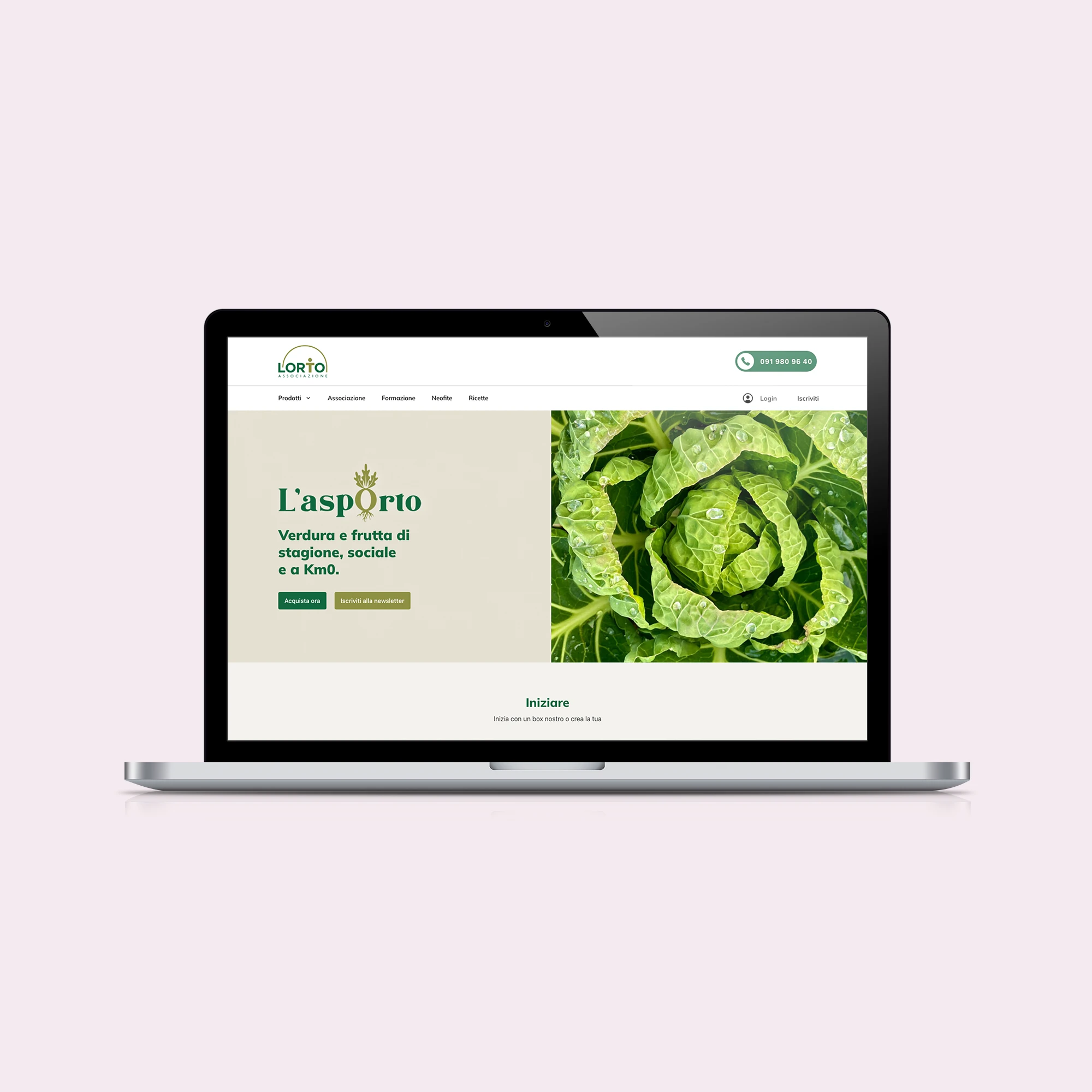
- Built a content-led site with the produce calendar at its centre: partners and shops want to know what's actually being harvested this week, not what the organisation's mission statement is.
- Replaced stock imagery with photographs from the garden itself, taken over a year. The participants aren't pictured; the work is.
- Wrote the copy alongside the team, in Italian, French and English. We took out almost every adjective.
- Set up a quiet contact path for partner organisations and prospective participants: separate inboxes, separate language, no public form mixing the two.
- Made the site editable by the team without coming back to us. The seasonal calendar updates itself from a small spreadsheet they already maintain.
Outcome
Orto now has a site that quietly does its job. The partner inbox is busier than it was; participants who arrive at the site find a page written for them, not for donors. The seasonal calendar has become the most-visited page on the site, which is exactly the page that should be.
The brief was to stop the website from getting in the way of the work. We think it does that now.