Case study
Hope Support
A UK charity providing support to children and young people whose parents have developed a serious or life-threatening illness. A small team, a heavy subject, and a website that needed to feel like a steady hand rather than a marketing brochure.
The brief
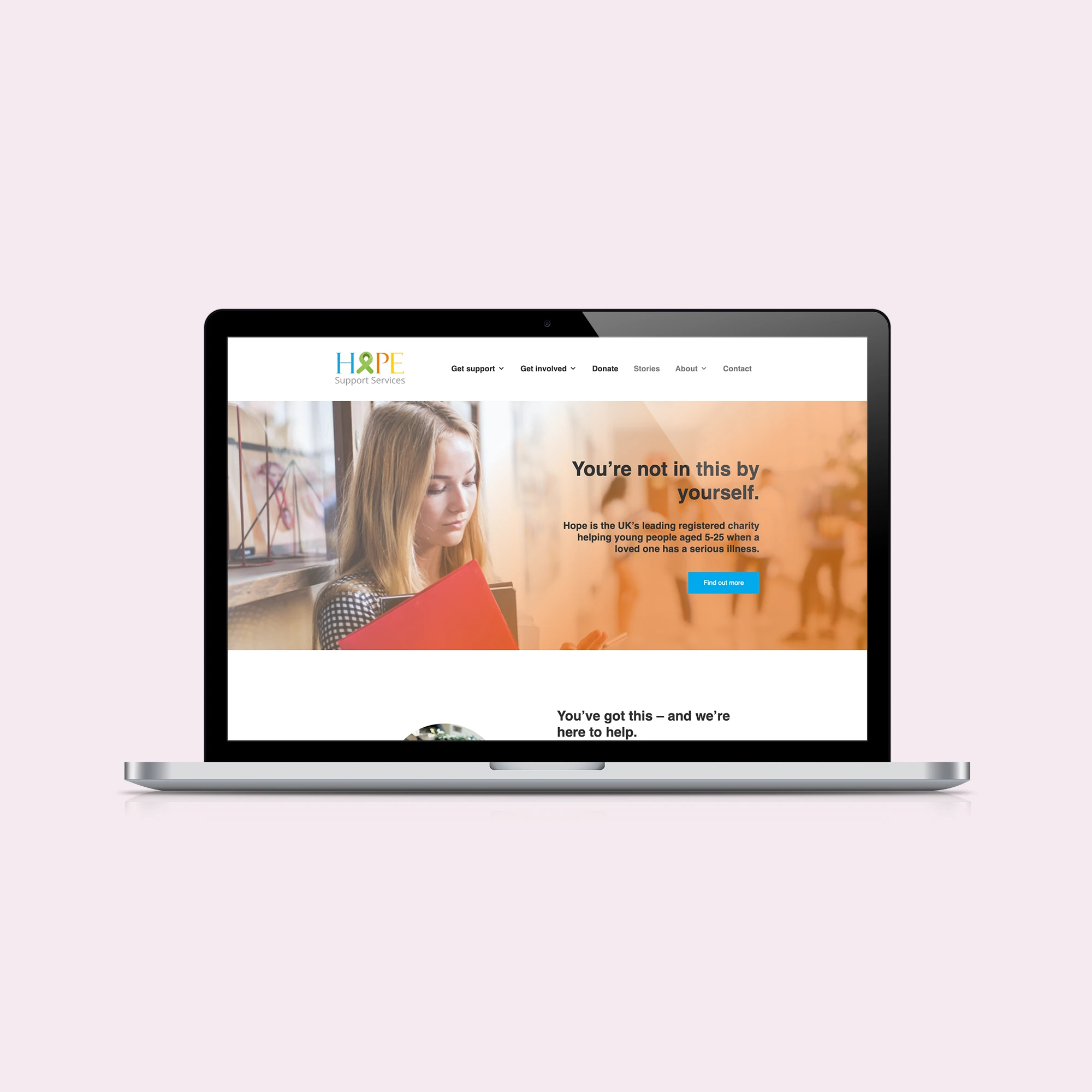
Hope Support's existing identity had been donated years earlier and never quite fitted. The colour palette was bright and the imagery was upbeat in a way that didn't match the moment most visitors were arriving in. A family looking for help often comes to the site shortly after a diagnosis. The site needed to feel calm, careful, and competent, not cheerful.
It also had to do practical work: parents and young people needed to find what was available in their area, referrers needed to send people to the right page, donors needed a clear path to give without that path taking over the site.
What we did
- Worked through a full rebrand with the team: wordmark, palette, type, photography direction. We landed on something quieter and more grown-up than the previous identity, with room for the warmth the team genuinely has.
- Restructured the site around four audiences: young people, parents and carers, referrers, and donors. Each has a clear front door and a clear set of next steps.
- Rewrote the help-finding journey end-to-end with the charity's services team. We removed jargon, added the things people actually ask in the first phone call, and put the referral path one click from the homepage.
- Did a full accessibility pass against WCAG 2.2 AA, with assistive-tech testing on the help journey in particular. A young person using a screen reader to look for help shouldn't have to fight the form.
- Set up the site so that the small team can maintain it themselves: content edits don't require us in the loop.
Outcome
The launch was deliberately quiet. The charity reports that more young people are completing the help-finding journey on the new site than on the old one, and the team's own confidence in the brand is, if anything, the more meaningful change. The site does what a small charity's site should do: it gets out of the way of the work.
The kindest thing a website can do for someone in crisis is be quiet and clear.